


Nailing your restaurant website: 5 ways to increase bookings

Do restaurants need a website?
They’re pretty damning figures: almost 70% of people are discouraged from visiting a restaurant because of its website. With endless options of where to dine, drink and order in from, first impressions really do make all the difference.
Unlike a book and its cover, no one ever said “don’t judge a restaurant by its website” because the reality is that’s exactly what your customers are doing. Before choosing to order delivery, an incredible 90% of customers look at a restaurant’s website so imagine how many are perusing your website before making a booking and visiting your establishment.
In 2021, having a killer restaurant website is critical to success and with the steep change to digital—reflected by both the retail and hospitality industries—restaurants need to keep up or they’ll be left behind.
Here are five things you can do to ensure your restaurant website is at the top of its game in order to maximise bookings at your venue.
What should a restaurant website have?
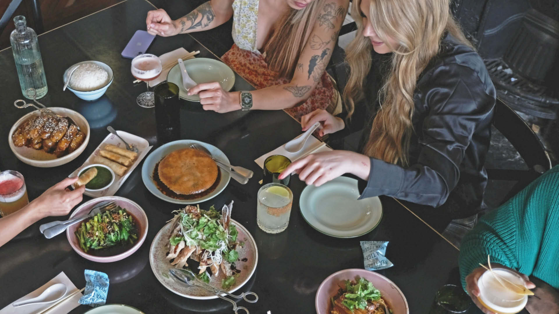
Include a menu
Do you visit a restaurant’s website before dining? You’re not alone, as 77% of diners check a restaurant's website before eating there. So including a menu on your website is crucial. But don’t just put the dishes on there and think that that’s good enough. Many restaurants might have menus on their website, but they don’t say all that much.
Remember to include the key components that will impact the decision making of customers and those coming to your website. These include ingredients, marking which dishes are suitable for different dietary requirements, such as vegan, vegetarian, gluten-free or dairy-free. Include prices and - better still - photos, because professional food shots can boost your sales by at least 30%.
You also want to ensure that your menu is mobile-friendly as these days, most people are checking out your website on the go. So forget the clunky PDF — it’s no longer an acceptable way to showcase your menu — and see how me&u seamlessly integrates with your website so that customers can see a visual dine-in and pick-up menu that accurately labels each dish, while showcasing stellar food photography that is guaranteed to entice.
Make reservations seamless
Embedding a ‘book now’ button may very well be one of the most critical ways to increase bookings at your venue. If booking, purchasing or finding something isn’t simple enough, consumers move on. They move on to something that is easier to find, purchase or book because, well, we’re all busy!
Ensure that making a restaurant reservation via your website is front and centre. We often see “book now” or “make a reservation” buttons hidden within the Reservations or Bookings tabs. Yes, you should include booking buttons on those relevant pages but it’s much more effective to give customers the ability to book on every page, including the homepage.
Putting a “book now” button in the header of each page will make sure customers know exactly how to make a reservation. Plus, because it’s so front and centre, consumers who are perusing your website — who may not have been planning to make a reservation — may be persuaded to do so due to the ease of the task.
Simplify online ordering
Much like booking, online ordering - whether for delivery or pickup — should be made just as simple. In fact, because digital ordering and delivery have been growing 300% faster than dine-in traffic since 2014, it can make an even bigger difference to your revenue stream.
Dining at a restaurant is an irreplaceable experience, however, it is apparent that online ordering will also be a key part of hospitality in future, so if that is something your restaurant is not yet offering, , it should become a priority.
Online ordering means seamless ordering. There are no phone calls necessary and consumers can simply order from their tablet, phone or laptop, making it a fast and hassle-free way to get business.
Include information that’s up to date
If a consumer is coming to your website, they want information that is relevant and up to date - it’s surprising how many restaurant websites either lack details or have outdated information.
It’s important your restaurant website showcases all the information that consumers want to know. Such things as opening hours and contact information should always be visible and easy to find. More importantly, is this information up to date? Are you now trading for longer hours per day? Has your venue email address changed? When, or if, these things do change, updating your website should be a priority.
An About Us page can also go a long way. You’d be surprised how many consumers love a back story, so this is the perfect place to communicate who you are, where you came from and what you stand for.
Your About Us page should represent who you are as an establishment and also as a brand, and should engage and inspire customers to try your food or visit your venue. Have a stand-out chef? Do you grow all your herbs on-site? Have key staff worked at some well-known or incredible venues? Here is the place to add all that information.
Stay true to your brand
From the get go, your restaurant website should reflect the ambience and personality of your venue. Your branding should be on point and that includes everything from the design and imagery to copy. There is nothing less inspiring than generic copy and stock imagery.
Your website is an online reflection of your bricks-and-mortar establishment, so treat it as such. Choose colours that reflect your ambience, fonts that accurately represent the level of class that is expected from your venue and imagery that is thoughtfully chosen.
This is where investing in a website designer and professional photographer can pay dividends, but ensuring that they don’t lose your personality in the process of creating a stylish website is key. Remember who you are and make sure your restaurant website is an accurate depiction of this.
Five examples of the best restaurant websites to inspire you
Building a killer website is easier said than done. So we’ve pulled together our favourite restaurant websites that take into account everything we've covered in this article, while also staying sleek and stylish.
Fancy Hank’s
Fancy Hanks’ website epitomises staying true to your brand. This fun, laidback, American BBQ eatery in Melbourne’s CBD is exactly what you see when you head to their website. Plus, they’ve hit the nail on the head by incorporating me&u's visual menu to whet the appetite and increase bookings or online ordering sales.
Not to mention, it is the first thing you see on their homepage, easily providing future customers with the information they came here to find.
Nobu, Malibu
Nobu Malibu’s website is inspiring, engaging and informative. It leverages its most impactful feature—its location—by opening with a stunning shot of the waterfront deck of the restaurant. Here, imagery plays a huge role; but that’s not all they’ve nailed.
In the top right corner of every page, you’ll see a Reservations button, while each tab provides useful information for customers including directions, detailed menus and hosting private events.
Ho Chi Mama
The pops of colour, the colloquial and fun copy and the photography make Ho Chi Mama’s website unique and oh-so on brand! Plus, their online ordering, reservations, menu and relevant information is all front and centre for customers to find with ease.
Big Gay Ice Cream
Sure, the fun illustrations, in-depth description of treats and on-brand imagery of the little ones enjoying their ice cream make Big Gay Ice Cream’s website stand out - but it’s the About Us page that really gets us.
Split into two, their About Us pages talk about their all-natural, soft-serve ice cream AND their heartstring-tugging personal story, having started as a food truck and moving on to become an award-winning, book-publishing New York City institution. We absolutely love it.
Quay
Sydney’s ultra high-end restaurant, Quay, does a great job at maintaining that classy and sophisticated feel through their website. Here, elegance and minimalism is key while also reminding customers why they want to dine here: the harbour views, of course!
The menu is easily accessible and despite its elite nature, lists the price for each set menu — a huge plus for customers wanting to know exactly how much they’ll be spending with a visit to your venue.
They also do a great job at explaining to visitors who their team is, who the head chef is, and what they stand for (in detail) via the About Us page.